
How do you make a feature like this…
…work on a screen that size?
Card Table is the latest addition to Basecamp’s arsenal of tools — it’s our opinionated take on Kanban, with a few signature tricks up its sleeve. The design for the feature was initially conceived for the web, but the Mobile Team had to make it work on Android and iOS too. This is our journey from zero to v1.0.
Three’s a crowd
At 37signals, it takes just two people to build a feature. Every project is staffed with one programmer and one designer — that’s it. We also adhere to strict time constraints, often shipping projects within 6 weeks or less. If you’re used to a more, say, traditional way of working (as I was), this might seem daunting or even crazy. In reality, it’s none of these things. It’s liberating. It’s also staggeringly effective.
I, a 37signals rookie, am being paired with Jamie, a 37signals veteran and designer extraordinaire, to start building Card Table for mobile. Designers here not only make the pixels pretty and UIs smooth, but they also run a complete development environment. They can build the apps locally and routinely commit code changes or bug fixes. From a programmer’s perspective, this is a godsend. With a development loop this quick and communication overhead this small, 6 weeks no longer look intimidating.
Doing nothing is always an option
Our Mobile Team is in a unique position thanks to the family of technologies invented here under the Hotwire umbrella. Our hybrid mobile apps can wrap every page of the Basecamp web app inside a native shell. It’s up to the Mobile Team to decide whether we want to override any given web page with native implementation. Here’s the trade-off: better fidelity, performance, and access to advanced platform capabilities on one side; maintenance and deployment burdens on the other.
The Web Team does a stellar job of making the web apps accessible and responsive, but embedded web pages have their limits for what we wanted in the Card Table for Android and iOS. So where is the sweet spot between native and web?
The most Kanbanesque thing
We decide early on that we have to support drag and drop if we are going to tackle Kanban. It’s one of its defining features — moving tasks through a linear process in a very tactile way — regardless of platform.
At 37signals we’re always trying to judo difficult problems. Drag and drop that works well and feels just right is definitely a feature we’d try to find judo solution to — there is a surprising amount of edge cases, fiddly math, and eventual battles with the UI libraries we would depend on. However, as we are weighing the pros and cons, we realize anything less simply wouldn’t do. “You are trying to sell me Kanban, but I have to move the cards how?” No way.
Smooth drag-and-drop interaction across columns that scroll in both directions becomes our epicenter. I spend a couple of days during a cooldown (2 weeks after each 6-week cycle when we can work on anything meaningful of our choice) to make a proof of concept in order to be sure we can accomplish this in a way that is satisfying and isn’t a nightmare to maintain.
To speed things up, I put the proof of concept code in a separate repository, with the bare minimum of scaffolding needed to run the demo app.
It’s throw-away code. Everything is hardcoded, and the tech stack is completely different from the production Basecamp Android app. It is a playground to try out things very quickly. Here’s the first working iteration:
There are a ton of things missing, of course, but the fundamentals work. We can drag cards up and down inside a column. We can drag cards between the columns, and everything scrolls automatically. This is a big win that only took a couple of days. The code is terrible, every possible corner is cut, and the performance is lacking, but now we know that we are onto something. We can confidently begin exploring.
Starting line
That’s right — exploring, not designing or developing. All we have is a very early web version of the Card Table, this initial mobile proof of concept, and a goal of making the real mobile version worth the effort. Jamie has not been working on some Figma file for the past few weeks. There’s no market research, no case studies, no focus groups, and no A/B tests. No committees!
No design handovers. No pixel-perfect tyranny.
It’s just the two of us — Jamie can code a bit, and I know a thing or two about UX design. We’re going to have fun.
Because the Card Table is a big, big feature, we allow ourselves a full 6-week cycle for exploratory work, with the goal of having a working version we can dogfood us with at the end.
Bird’s-eye view
We start with an overview of the card’s journey across the Card Table. Unlike the typical Kanban where cards move from left to right through a series of columns that are more or less equal, Card Table has opinions about the card lifecycle, while still providing a lot of flexibility. The following is a typical usage:
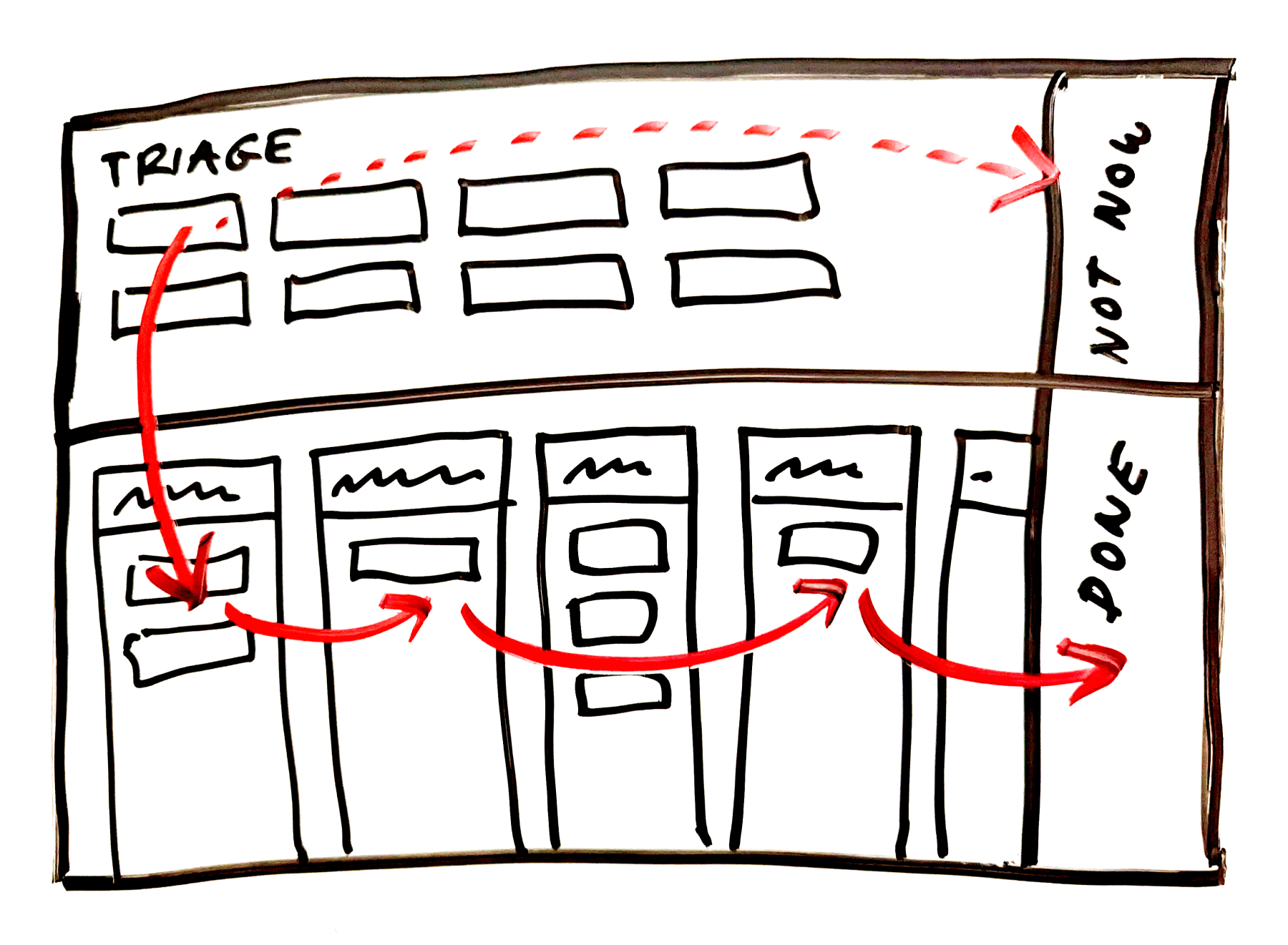
A card is born in the Triage, where it waits until someone decides its fate. If it’s deemed worthy, it moves to the first column below and travels through the familiar columns of traditional Kanban implementations. When the card is done, it retires to the Done column. Alternatively, if the time isn’t right, the card can be moved to the Not Now column — a waiting room (or purgatory?) of sorts.
This out-of-sight, out-of-mind idea behind Not Now and Done is an innovation you didn’t know you needed, as is the Triage being special and prominent. But the whole UI is very wide and tall, which is a problem on mobile.
The real estate available on a phone is simply too small to show the Triage and in-flight columns at the same time. We also want to preserve the general spatial relationships between all the main sections of the original web layout. Another reason is that assessing cards in the Triage is hard work. It’s usually easy to determine when a card should move to the next in-flight stage, but deciding if it should be allowed to go there at all — that’s the difficult question. We want you to be able to focus on that, so we try to remove all unnecessary distractions.
As Jamie and I are chatting about a possible direction, he shares this sketch:
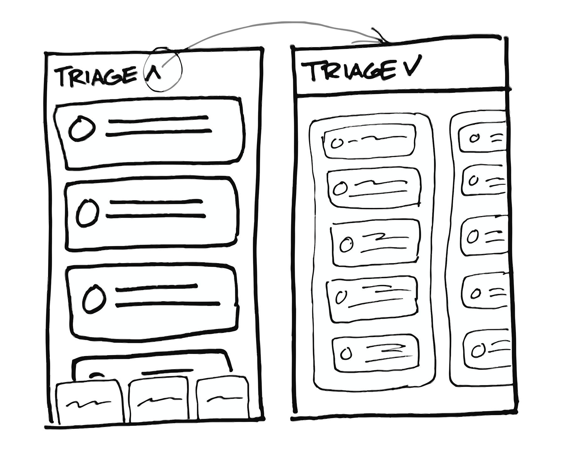
What if there is a way to expand the Triage while collapsing the columns?
Notice that at this stage, Done and Not Now are nowhere to be found.
Theory and practice
This is a compelling approach, but we have a problem: How do we know whether it will really work? We have this hypothesis about where the Triage should go, we can speculate that Not Now and Done should be somehow anchored to the right side of the screen, and we have no idea how moving the cards between these sections will turn out.
This feature is all about the interactions, so a clickable but otherwise static prototype made in some design tool won’t cut it. We need to get closer to the real thing, but stay very flexible at the same time.
The solution to this conundrum is… technology. Now I’m no longer excited about technology for its own sake. I’m much more curious about what it can do for me, not how big its marketing budget is. However, from time to time a technology comes along that is exciting in the right way.
I didn’t mention it before, but the first proof-of-concept app was built with the next-generation Android UI toolkit, Jetpack Compose. This thing delivers. It’s true that it accelerates UI development, requires less code to do stuff, eliminates whole classes of bugs (while inevitably creating a couple of new ones), yada yada yada. It’s great, it really is. But! My favorite thing about it is that it’s a fantastic prototyping tool.
Even if you don’t know any Kotlin or Compose, you can probably guess what’s going on here:
@Composable
fun TriageHeader(
    triage: TriageColumn,
    expanded: Boolean,
    onAddCardToTriage: (columnId: Long) -> Unit,
    onTriageMenuClick: (columnId: Long) -> Unit,
    modifier: Modifier = Modifier
) {
    Row(
        verticalAlignment = Alignment.CenterVertically,
        modifier = modifier.fillMaxWidth()
    ) {
        ColumnHeaderButton(
            title = triage.title,
            cardsCount = triage.cards.size,
            expanded = expanded,
            modifier = Modifier.weight(1f)
        )
        AnimatedVisibility(visible = expanded) {
            Row {
                SmallFilledButton(
                    text = stringResource(R.string.add_card),
                    icon = Icons.Add,
                    onClick = { onAddCardToTriage(triage.id) }
                )
                IconButton(
                    icon = Icons.Menu,
                    contentDescription = stringResource(R.string.column_menu, triage.title),
                    onClick = { onTriageMenuClick(triage.id) }
                )
            }
        }
    }
}
It’s declarative, it’s runnable, it’s interactive. It’s the real thing, it can be written and rewritten almost in seconds, and Jamie is able to pick up the basics quickly. So we decide to build a second prototype.
One big, continuous space
Ripping out some bits from the first proof of concept, I quickly throw together this:
It works! The Triage gets a lot of space, and the columns at the bottom are intuitively scrollable and clickable. The next piece of the puzzle to solve is the transition between the Triage and the in-flight columns.
If this was implemented using the legacy UI toolkit, I would take the easy (and, frankly, the only sensible) route of creating a different screen with the in-flight columns expanded, and navigating to it after clicking on the column headers. But I’ve used Compose extensively before, and I know what it’s capable of, so I want to push it a bit.
What if the Triage and the in-flight columns lived on a single screen, just like on the original web page? Thirty minutes later, I can show Jamie this:
The animations need a ton of work (but hey, Compose provided them practically for free), but we love the sense of continuity this creates. It’s like turning over a folded newspaper that is too big to hold unfolded, instead of ripping it in two halves and stuffing one in your pocket.
I still have doubts about performance and what will happen when we add all the missing things to the screen (it’s a lot), but we’re excited about this direction, so we pursue it further.
In the meantime, after several iterations, Jamie finds a place for the Done and Not Now columns. It turns out that the Done column shouldn’t be sticky when the in-flight columns are collapsed:
A small but impactful difference. There will be many more choices like this one to make.
That moment
Happy with the interactions so far, we tackle the next task: We need to move the cards between the Triage and the in-flight columns.
The obvious way is to make the in-flight column headers drop targets, so when you release the card over a column, it sinks into it. This could work quite well, but what if the position of the card inside the column has a special meaning in your workflow? Or what if you want to move the card directly to the On Hold section of that column? This simple implementation would require you to move the card to the column, open the column, and then move the card again. Can we do better than that?
Let’s look at what we currently have: A pleasant toggle behavior between the Triage and the in-flight columns, and also a custom drag-and-drop framework that’s becoming quite feature-rich (for our needs, we’ve hit the limits of Compose’s drag-and-drop APIs a long time ago).
What if we combine these things to make that interaction better? What if I add a trigger that fires when a card is dragged over the in-flight column headers, and it toggles the sections while the card is still being dragged? That couldn’t possibly w…
Yes! Yes!!! This. Is. It. Even unpolished, this implementation already feels so good! From this moment on, we are totally, positively sure that the native version is worth it. Our process allows us to revert to the web-based implementation at any moment at our discretion (what a luxury!), but this is our Rubicon.
Checking for doneness
Of course, there’s a lot more to the Card Table than moving cards around.
The Web Team has to implement a minimal but complete set of features for launch, building upon a great foundation that they already have in place. On mobile, Card Table is the biggest native feature attempted so far, which means it’s mostly a green-field project. That is good and distressing at the same time.
After the first 6-week cycle spent exploring, we have one more cycle to actually ship production-grade version 1.0. We’ll get no extra development help, and six really means six. These constraints prevent us from delivering cooked-to-death software. By default (an imperfect analogy alert!), we aim for medium, but in this case, we aren’t afraid to serve it rare.
So we pick up the good ol’ scope hammer and start swinging it mercilessly. It’s tough, and it’s a difficult skill to master, but you have to kill your darlings to be able to ship. So…
Optimistic updates? Only where absolutely needed. Empty states? Better design the UI in a way there’s nothing extra to implement. Haptic feedback? Yes, but again, only when absolutely needed. What about the Card Table context menu?
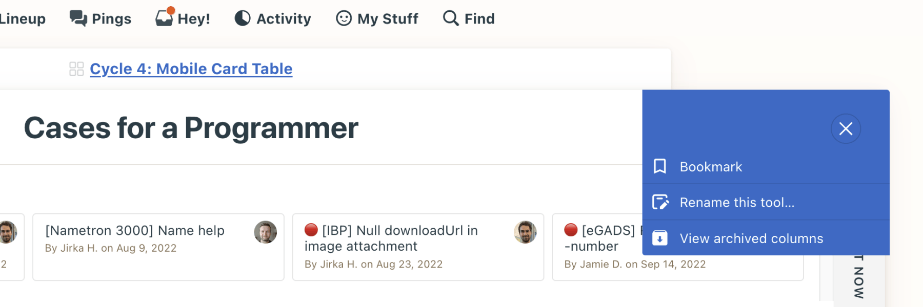
Looks essential, doesn’t it? Nah, not for v1.0, sorry. But then there’s the column context menu:
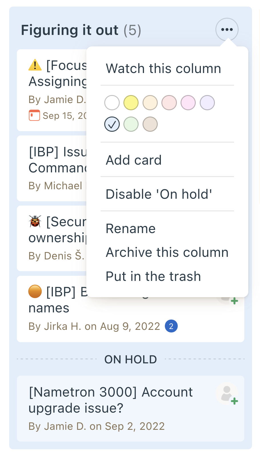
That also looks like too much for our humble v1, but at the same time, some of the options are genuinely useful. Let’s see what we can squeeze in, but we won’t sweat over this. Basecamp is web-first anyway.
Here’s the plot twist: In the end, it turns out we have enough time to add most of the menu options, and one of them is particularly interesting. The web version allows dragging and dropping whole columns, to reorder them:
For several reasons, this isn’t feasible right now. But wait, can we offer you at least something?
Of course we can! It’s judo time: Given that you’ll set up your Card Table once at the beginning (and probably on the web), we can afford to go with the simplest UI possible. I jump straight into the code, throwing a couple of the most basic components on the screen (buttons are the best, a freeform text input is a hassle), and we have this:
Granted, this isn’t as spectacular or hands-on as drag and drop, but is it better than nothing and will it allow you to achieve your goal in the end? Yes and yes. Jamie likes it, and it took less than an hour. Great! Next, please…
Ship stuff that matters
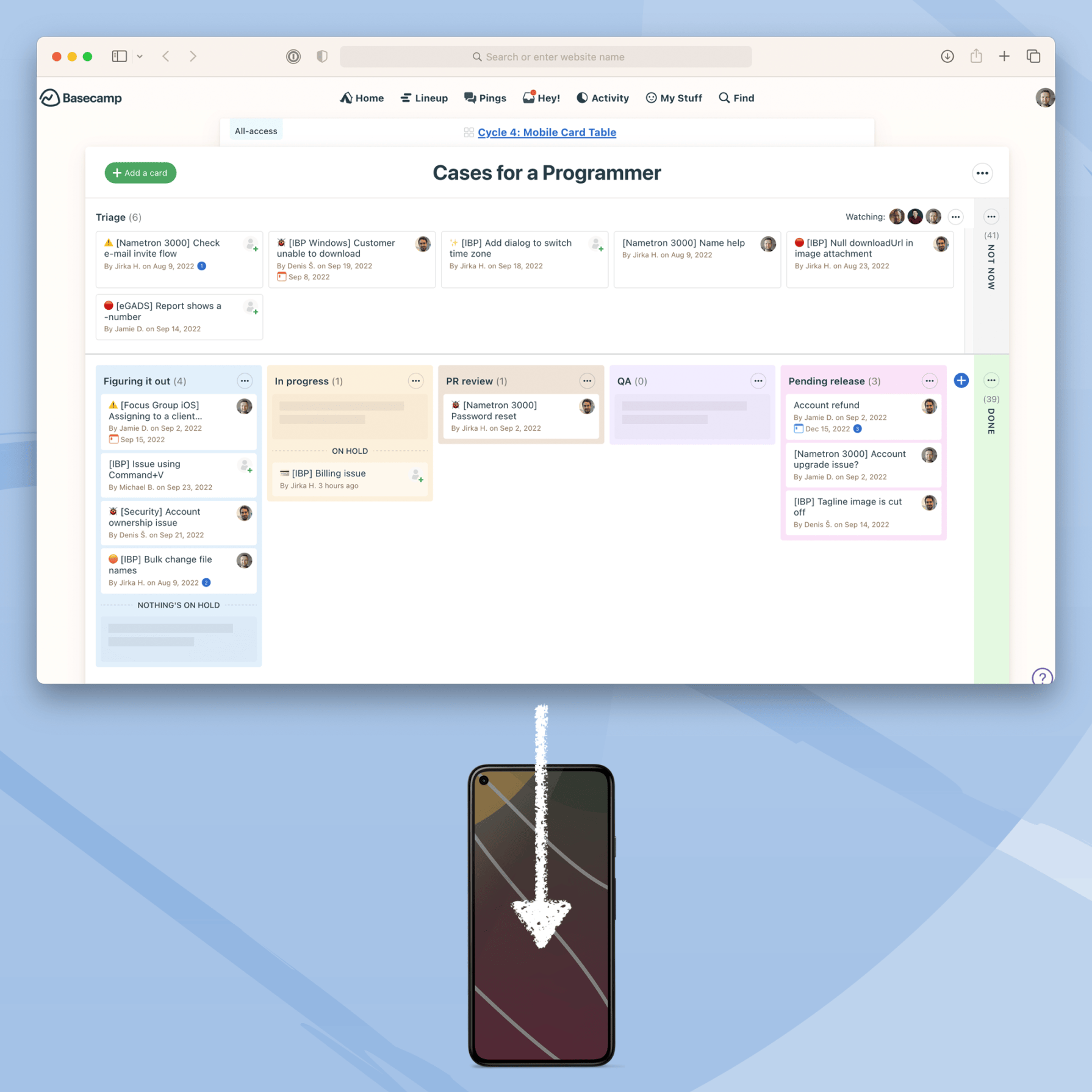
Fast forward several months, and this is what Card Table looks like now:
There are some small pieces added or polished here and there, but there never was a second Card Table cycle. Our iOS friends, having slightly different priorities, shipped with even less! And you know what? It was just fine. Or more than fine, actually — the feature works great, our customers seem to love it, and development-wise, the effort/value ratio is awesome.
This is the magic of Shape Up. Embrace the constraints, give the team autonomy, and enjoy the ride instead of dreading the death march. The results will surprise you, and you’ll have a lot of fun in the process.
Sign up to get posts via email,
or grab the RSS feed.