Maintaining parity in a multi-platform product
Expectations for a product are higher now than ever. Users expect to use their software to be available everywhere: on the web, on desktops, on their mobile devices. Development for all these platforms is fractured so most companies rely on different teams for each platform. At 37signals, we have a dedicated product team for the web and a dedicated product team for Mobile (iOS/Android). Both of these teams work together to build and maintain our products, but their approach is as different as their platforms.
When the idea of implementing a new feature reaches maturity, I’ve often found that web work is done before mobile work. This is especially true with our two-person teams. Using a one-person framework the web team can begin working immediately — create any new controllers, build the UI, submit to code review and then… they can just ship the feature.
Mobile developers of server-driven apps like Basecamp and HEY usually begin by waiting for the web team to wrap up their work so the apps can consume an API. Then, after building the native UI and having their code reviewed, they submit their apps to the App Stores and wait… sometimes an hour, sometimes a day, and — inexplicably — sometimes a week or more.
Since priorities can shift quickly — say, every 6-weeks — there are times where it makes more sense to build a feature on the web and allow the mobile apps to catch up sometime down the road. While not ideal, it allows the product to improve quickly at the cost of a feature being available on the web and not on mobile apps.
At 37signals we ship most features in all our platforms at the same time. Let me walk you through how we harness the power of Turbo and responsive web design to reduce this natural lag and focus each team’s efforts where their strengths lie.
Building a new Basecamp feature natively
Basecamp’s Latest Activity tab allows you to know what happens across every team and project in real-time. Each of the Activity Reports provides information like all latest activity, someone’s activity, someone’s assignments, Mission Control, to-dos added & completed.
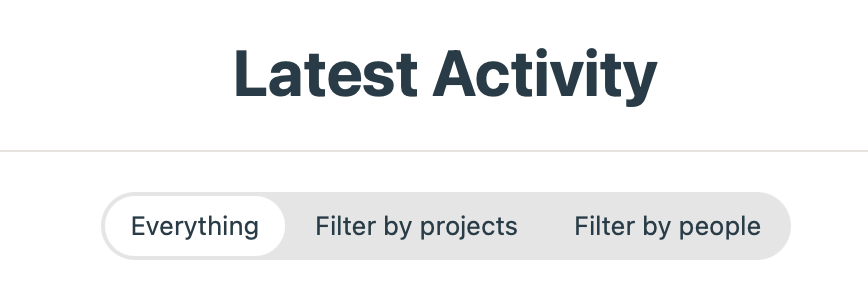
Recently, our Product team had a great idea to customize our All Latest Activity Report so you can filter by project or by people.
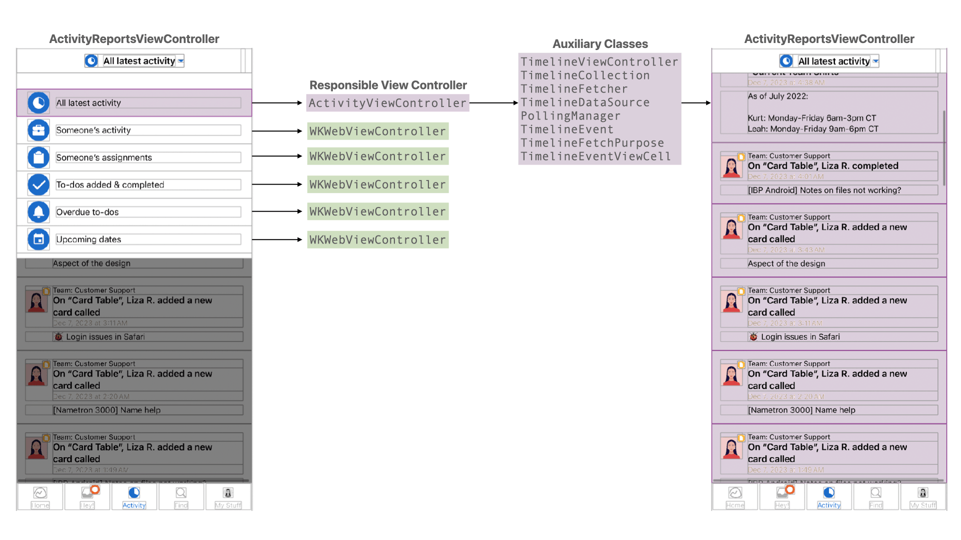
If we peek behind the iOS curtain, ActivityReportsViewController handles the native popup menu that lives in the navigation bar as well as navigation (push/pop) of new controllers. It also acts like a pseudo-tab bar controller by presenting child view controllers depending on the report selected:
- All latest activity is handled by
ActivityViewController— a nativeUITableViewControllerwhich has its own fetcher, data source, view models, polling manager, and auxiliary classes. - Other reports are handled by Turbo via a subclassed
WKWebViewControllerand load a Turbo web page.
If you tasked most iOS developers with building the filter natively, they will quickly build it in UIKit or SwiftUI. Then they’d likely write down the API requirements: maybe a GET endpoint that receives a query string that they can build so the server can return the correct results. Finally, they’d wait for the Ruby developer to wrap up the backend work so they can consume said API. Transform the JSON, pass the struct to their ViewController or SwiftUI view and voilà!
I’m sure most Android developers would follow a very similar process.
Now, if we take a step back, this screen is basically just a list of server-driven results. As a mobile developer, it’s awesome to build new stuff, but after the 10th time I have to build the exact same feature the web team already built it gets dull. Do I really have to wait for someone else (the Rails developer) to unblock me and then wait for yet another person (the App reviewer) to allow me to ship their work so I can update a list?
No, let’s not build this using purely native code. On the contrary, we’re going to leverage Turbo to offload this simple list view to the web.
Building a new Basecamp feature using Turbo-iOS
ActivityReportsViewController displays the navigation menu and depending on the selected report will either move to the native ActivityViewController or to a Turbo-powered web view. Just to give you an idea how much more code it takes to build a native view instead of presenting a web view, here’s a helpful diagram.
What if instead of making this distinction, we load the All Latest Activity report directly via the web using Turbo-iOS?
Instead of differentiating between reports…
/// A new report was selected from our native drop-down menu.
private func loadChildReport(_ report: Report) {
    if report == .latestActivity {
        loadActivityChildViewController()
    } else {
        loadReportChildViewController(for: report)
    }
}

/// Load native report using ActivityViewController.
private func loadActivityChildViewController() {
    let viewController = ActivityViewController()
    switchTo(childViewController: viewController)
}

/// Load web report using WKWebViewController.
private func loadReportChildViewController(for report: Report) {
    let url = URLForPath(report.path)
    let viewController = navigationCoordinator.makeViewController(for: url)
    navigationCoordinator.beginNavigation(to: viewController, from: self)
    switchTo(childViewController: viewController)
    navigationCoordinator.finishNavigation(to: viewController)
}
Let’s treat them all the same:
/// A new report was selected from our native drop-down menu.
private func loadChildReport(_ report: Report) {
    loadReportChildViewController(for: report)
}

/// Load web report using WKWebViewController.
private func loadReportChildViewController(for report: Report) {
    let url = URLForPath(report.path)
    let viewController = navigationCoordinator.makeViewController(for: url)
    navigationCoordinator.beginNavigation(to: viewController, from: self)
    switchTo(childViewController: viewController)
    navigationCoordinator.finishNavigation(to: viewController)
}
And when we run the app, the native screen doesn’t load anymore. Now, it’ll load the URL for the All Latest Activity report:
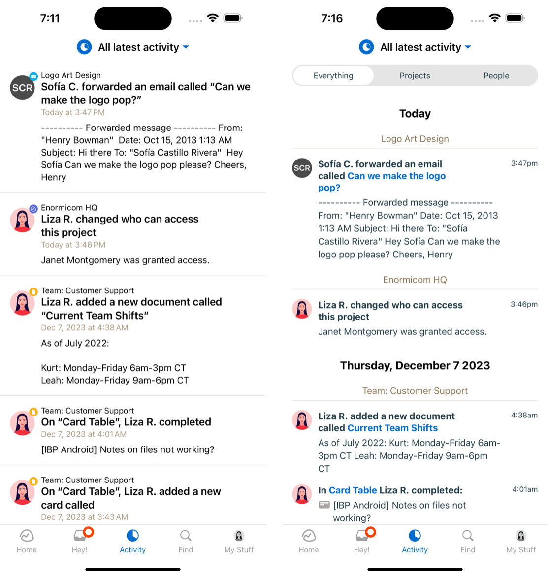
By loading the web view, we get the filter for free! It just seems too good to be true, doesn’t it?
Okay, I hear you saying, “You’ve lost the strengths of mobile! Where’s the speed? Where’s the multitouch? Where’s the smooth animations?”
They’re all here, see for yourself:
As you can see, there isn’t a noticeable difference in speed. Natively, we’d ping the API and transform the JSON into something our UITableView would consume. Now, we’re loading a webpage using Turbo 8 which is very fast and will cache webpages. We’re still doing a round-trip to the server, but Turbo allows us to cache the webpage and load it almost as fast as native UI.
Then, system gestures and animations are intact. Turbo-iOS allows us to intercept navigation and decide whether we want to load a new view controller, or replace the web content being shown. By loading a new native view controller, we still have all the navigation gestures we need. For instance, users can swipe left to go back in the navigation stack, or swipe right to go forward.
Finally, all the smooth animations are there. Native push and pop means we get 60fps (or more! depending on your iPhone). Our top navigation menu is still native, so we have the playful bounce animation and the fade of the content below.
There is a bit more work beyond native code
That was a nice demo, wasn’t it? It’s obviously not perfect. There are two important aspects you have to keep into account:
The most glaring issue here is that you need to have designers on the web who care about small screens. Our mobile teams have dedicated web designers that will help iron out any weird details that pop up. Our native apps use custom CSS thanks to our amazing designers. They maintain this CSS so the interface becomes as native as it can be.
Then there’s using Turbo-iOS for intercepting navigation. That is something new for iOS developers and can have a learning curve that can make some uncomfortable. Fortunately, we have excellent documentation in our Turbo-iOS demo. See, for example, how we manage to intercept links and decide whether we should present a native view or another web view by reading on Path Configuration.
The benefits outweigh the disadvantages
Yes, there’s is a learning curve, but it’s not steep and look at what lies beyond:
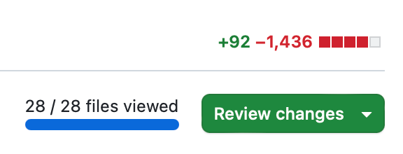
I removed 10 files (the table view, its view models, its JSON fetcher). All in all 1,436 LOC down.
Not only that but from now on any changes to this page happen entirely on the web side. Need to add a fourth filter? Add it on the web and instantly deploy! Turbo ships a new feature to make loading faster? The native apps benefit immediately.
All while keeping the same native popover menu and the same native navigation — yes, that includes animations.
When should I use Turbo-iOS?
Every new mobile app we start here at 37signals begins with Turbo as a core library, even if we decide most of it will be native – like HEY Calendar. Turbo is a critical part of our navigation layer, giving us incredible sense of freedom by allowing us to decide whether to sweat out the details of a screen or delegate it to the web.
Does this mean we offload our responsibilities to the web for every screen? Of course not! As much as I like the web, native really is superior when it comes to gestures and animations. High traffic screens, like Basecamp’s Hey! menu, are completely native because we want the smooth animations, custom multi-touch gestures like swiping cells, and animations every time a new entry is received from the server.
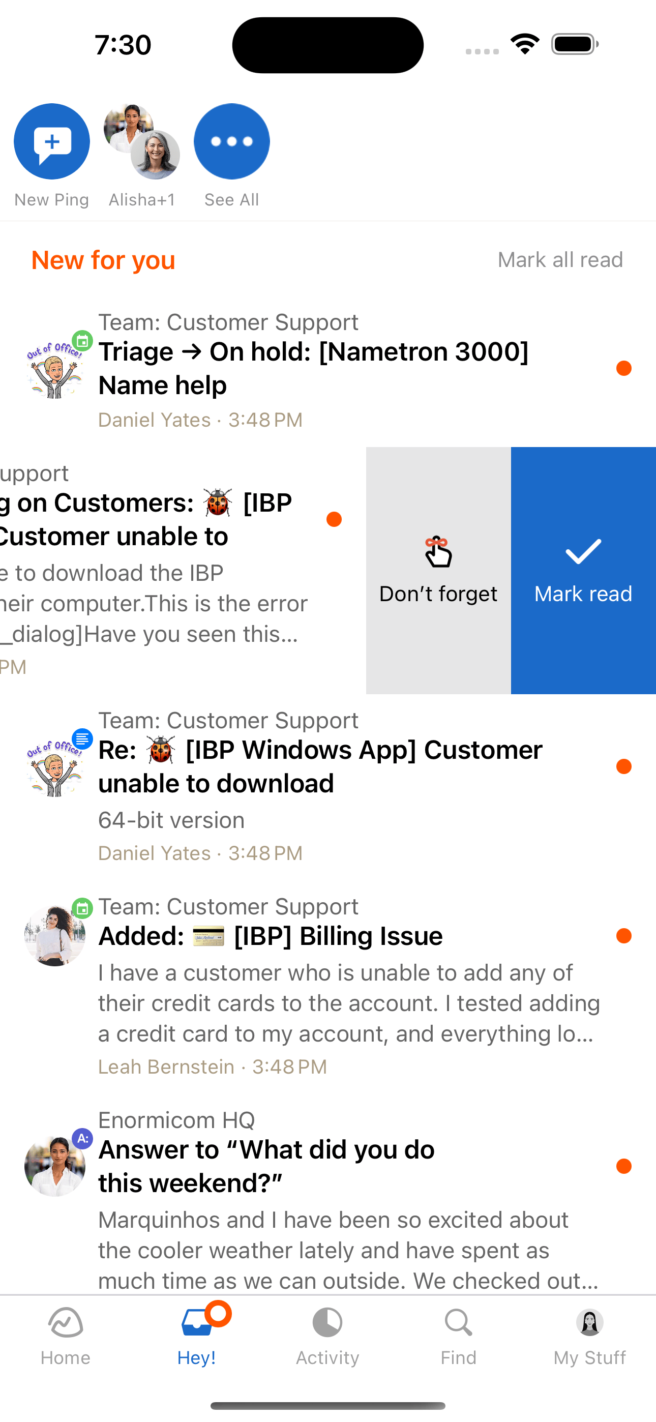
But for most screens? Turbo-iOS is more than enough and it offers feature-parity as par for the course. Just like you saw above with our Latest Activity transformation, most of the features from the web require a very light touch from a native developer. Which frees us to focus on our strengths and allows the web team to focus on theirs.
Our users get the best of both worlds: the silky smooth user experiences of the native world and the development speed of the web world.
How’s that for speed? 😉
Sign up to get posts via email,
or grab the RSS feed.
