Recently, customers who have purchased a copy of ONCE/Campfire were invited to participate in a live walk through the app’s CSS code. Campfire was built with vanilla CSS, fully #nobuild without compiling or preprocessors, and uses the latest web platform features available in evergreen browsers—CSS nesting, :has(), :is(), and :where(); wide-gamut colors, View Transitions and more.
In this post we’ll take a look at how we’re using some of these features and share some helpful patterns discovered along the way.
Colors
Campfire uses oklch() to define colors in CSS. oklch() offers access to wider color spaces (like Display-P3) and greatly improves developer ergonomics when working with colors. For example, let’s take a look at these greys used in Campfire’s UI.
:root {
  --lch-gray: 96% 0.005 96;
  --lch-gray-dark: 92% 0.005 96;
  --lch-gray-darker: 75% 0.005 96;
}
At first glance they may seem unfamiliar but they’re actually more readable and quite easy to use once you get acquainted.
LCH stands for:
- Lightness: perceptual lightness ranging from 0%—100%;
- Chroma: the amount of color from pure grey to full saturation, 0–0.5;
- Hue: the color’s angle on the color wheel, 0–360deg.
With that in mind, we can read the colors without much effort. We can see that they all share the same hue and chroma, only the lightness differs. It’s apparent just from reading the code that --lch-gray and --lch-gray-dark are relatively close in lightness, but --lch-gray-darker is significantly darker. It’s also simple to adjust them programmatically or manually tweak them without using a color picker and without inadvertently shifting the hue. If you’ve ever tried to do that with RGB colors you know how tricky that can be.
We started by defining the pure color values above but we wrap them in the oklch() color function and define a set of abstract custom properties that consume the values for use in our other stylesheets.
--color-border: oklch(var(--lch-gray));
--color-border-dark: oklch(var(--lch-gray-dark));
--color-border-darker: oklch(var(--lch-gray-darker));

Sure, you might be thinking, grey is easy but what about other colors? Here’s a set based on blue for links and selections.
--lch-blue: 54% 0.23 255;
--lch-blue-light: 95% 0.03 255;
--lch-blue-dark: 80% 0.08 255;

--color-link: oklch(var(--lch-blue));
--color-selected: oklch(var(--lch-blue-light));
--color-selected-dark: oklch(var(--lch-blue-dark));
A quick read of these values reveals that all three are in the same color family, indicated by the same hue angle (255º). Further we can observe that links are medium lightness and saturation. The light variant has a much higher lightness value and much lower saturation making it more grey, while the dark variant is not quite as light or desaturated. We generally use the darker variants for borders around the lighter values.

And even better, oklch() makes it trivial to add variants that use alpha transparency, too.
--color-link-50: oklch(var(--lch-blue) / 0.5);
Custom Properties
Variables in CSS are certainly not new but we’ve developed some general usage patterns that make working with them a pleasure. Let’s look at some styles from Campfire’s buttons.css to demonstrate.
Declared vs. Fallback values
Often when using custom properties in the past, we’d set something up like this in which you declare all the custom properties at the top of the rule (or in :root) and then use them immediately below. Something like this:
.btn {
  --btn-background: var(--color-text-reversed);
  --btn-border-color: var(--color-border);
  --btn-border-radius: 2em;
  --btn-border-size: 1px;
  --btn-color: var(--color-text);
  --btn-padding: 0.5em 1.1em;

  align-items: center;
  background-color: var(--btn-background);
  border-radius: var(--btn-border-radius);
  border: var(--btn-border-size) solid var(--btn-border-color);
  color: var(--btn-color);
  display: inline-flex;
  gap: 0.5em;
  justify-content: center;
  padding: var(--btn-padding);
}
And that works fine but it feels like a lot of boilerplate and it’s a little defensive in that you may never use those variables again. That’s where fallback values come in handy. Instead of a litany of properties at the top of the rule, we can set the default values inline but expose a custom property that will accept another value when present. It looks like this:
color: var(--btn-color, var(--color-text));
Here --btn-color is optional. If it’s set, the rule will use that value; if not, it will fall back to --color-text. The fallback value can be a straight value or another variable. Now we can re-write the rule above like this:
.btn {
  align-items: center;
  background-color: var(--btn-background, var(--color-text-reversed));
  border-radius: var(--btn-border-radius);
  border: var(--btn-border-size, 2em) solid var(--btn-border-color, var(--color-border));
  color: var(--btn-color, var(--color-text));
  display: inline-flex;
  gap: 0.5em;
  justify-content: center;
  padding: var(--btn-padding, 0.5em 1.1em);
}
This is tighter and all the default values plus exposed variables are together, inline.
But how do we decide where to use custom properties? There are really two cases: 1) whenever we need to use the same value in more than one place (DRY) and 2) when we know a value is going to be changed.
A good example of the first case is the --btn-size variable. Almost all of Campfire’s buttons are circles with an icon inside. To make sure they line up nicely with input fields we set their block-size using this variable.

Because that size is exposed at the :root level we can use it for buttons and input elements. And even better, we can use that value to calculate the height of the chat footer in our layout. No magic numbers in sight!
:root {
  --btn-size: 2.65em;
}

body {
  --footer-height: calc((var(--block-space)) + var(--btn-size) + var(--block-space));

  grid-template-rows: 1fr var(--footer-height);
}
The footer’s height consists of the button’s height plus padding above and below using the global --block-space variable.
The other case for custom properties is when we know that we’ll want to change some values to create variants of an element. We think of it like a mini API for our CSS classes. Going back to our button class, we can declare variants simply by changing the value of custom properties instead of redefining a property.
/* Variants */

.btn--reversed {
  --btn-background: var(--color-text);
}

.btn--negative {
  --btn-background: var(--color-negative);
}

:is(.btn--reversed, .btn--negative) {
  --btn-color: var(--color-text-reversed);
}

.btn--borderless {
  --btn-border-color: transparent;
}

.btn--success {
  animation: success 1s ease-out;

  img {
    animation: zoom-fade 300ms ease-out;
  }
}
This makes it very clear what’s changed by these variants. Even better, as in the case of .btn--success, it makes on obvious distinction between changing a default property value and adding a new property (the animation property in this case).
CSS :has()
We started using :has() in the early stages of Campfire’s development because it offers a number of conveniences and opportunities to do with CSS what we previously had to do in server side code. We were so bullish on :has() that we literally shipped the first beta version of Campfire a week before Firefox shipped its release with support for :has()—the last of the major browsers to do so.
You can think of :has() as a way to query an element about what’s inside it.
This makes our button class very flexible. You can throw about any combination of things inside it, and it will adjust accordingly. Text only, image and text, image only, inputs (like radio buttons), or multiple images with text.
For example, when our .btn class finds an image inside of it (that’s not an avatar photo), it can apply sizing and make sure it gets inverted in dark mode—without needing any kind of special classes.
.btn {
  ...

  img {
    -webkit-touch-callout: none;
    user-select: none;
  }

  &:where(:has(img):not(.avatar)) {
    text-align: start;

    img {
      filter: invert(0);
      inline-size: 1.3em;
      max-inline-size: unset;

      @media (prefers-color-scheme: dark) {
        filter: invert(100%);
      }
    }
  }
Most of the buttons in Campfire contain an icon image plus a hidden text element for screen readers.
<%= form.button class: "btn btn--reversed center", type: "submit" do %>
  <%= image_tag "check.svg", aria: { hidden: "true" }, size: 20 %>
  <span class="for-screen-reader">Save changes</span>
<% end %>
With :has() our button class can know if these elements are present and turn it into a circle icon button with the image centered inside it. Notice that we’re using our --btn-size variable from earlier.
&:where(:has(.for-screen-reader):has(img)) {
  --btn-border-radius: 50%;
  --btn-padding: 0;

  aspect-ratio: 1;
  block-size: var(--btn-size);
  display: grid;
  inline-size: var(--btn-size);
  place-items: center;

  > * {
    grid-area: 1/1;
  }
}
Just dump whatever you want into .btn and it’ll take care of the rest.
That’s really satisfying to use as a developer but you could do this without a lot of extra effort using utility classes like .btn--circle-icon or .btn--icon-and-text. What really opened our eyes was when we were able to replace Ruby on Rails code with just CSS.
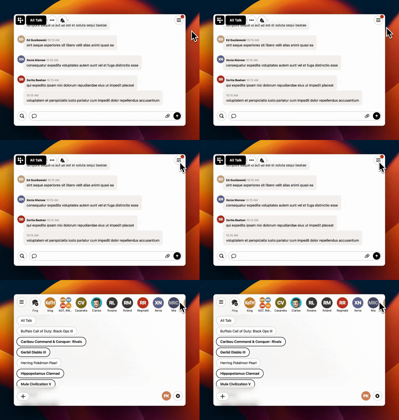
Take, for example, the menu button that toggles the sidebar when using Campfire with a narrow viewport.

Because the sidebar (which lists all of your chat rooms) is hidden when closed we wanted to display a small dot on the menu button to indicate that you have rooms with new, unread messages in them. Normally we’d have to write some Ruby on Rails code to handle that condition something like this:
<% if @room.memberships.unread.any? %>
  // render the dot
<% end %>
But with :has() we can do it with pure CSS alone!
#sidebar:where(:not([open]):has(.unread)) & {
  &::after {
    --size: 1em;

    aspect-ratio: 1;
    background-color: var(--color-negative);
    block-size: var(--size);
    border-radius: calc(var(--size) * 2);
    content: "";
    flex-shrink: 0;
    inline-size: var(--size);
    inset-block-start: calc(var(--size) / -4);
    inset-inline-end: calc(var(--size) / -4);
    position: absolute;
  }
}
Here the we’re querying the sidebar element to 1) make sure it isn’t open (because you don’t need to see the dot if you’re already looking at the rooms list) and 2) to see if it has any elements inside it that have the .unread class. If those are true, draw the dot and position it. Notice that we’re using a custom property (--size) here for both the dimensions of the dot and to calculate its border radius and position. It’s harmonious and avoids magic numbers.
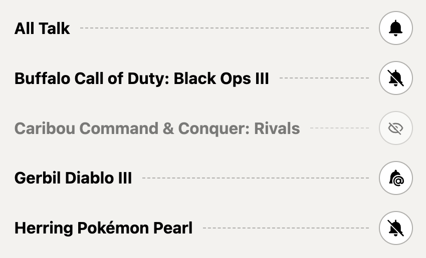
Elsewhere, on Campfire’s account profile screen we used :has() to solve a problem that was nearly impossible to do even with server side code. The screen features a list of all the chat rooms you’re in and a button to toggle the state of each room. If you’ve made the room invisible in your sidebar we also wanted to be able to grey out the row to visually reinforce this critical status.

The problem is that toggle button is a completely separate element using a different controller, rendered in a Turbo Frame. It’s the same toggle we show in the room, itself. That means the code that renders the row has no idea what status of the button is, nor does it know when the status changes.
<li class="flex align-center gap margin-none min-width membership-item">
  <%= link_to room_path(membership.room), class: "overflow-ellipsis fill-shade txt-primary txt-undecorated" do %>
    <strong><%= room_display_name(membership.room) %></strong>
  <% end %>

  <hr class="separator" aria-hidden="true">

  <span class="txt-small">
    <%= turbo_frame_tag dom_id(membership.room, :involvement) do %>
      <%= button_to_change_involvement(membership.room, membership.involvement) %>
    <% end %>
  </span>
</li>
Now we could, of course, use Javascript to get the state, observe changes, and update the view. Or we could re-write this code to re-render the entire row when the notification state changes, but then we’d be writing a duplicate toggle that is only slightly different than the one used elsewhere.
A third option is to write a single CSS rule!
.membership-item:has(.btn.invisible) {
  opacity: 0.5;
}
If the row has a button in toggled to the .invisible class, dim it.
Advances in CSS have been slowing replacing Javascript code over the last few years, now it’s coming for server side code!
One more?
Campfire’s direct message feature, which we call Pings, displays all of your active conversations across the top of the sidebar. Depending on how many people are involved, Campfire displays one, two, three, or four avatars to represent the chat.

Normally our view template would need to count the number of participants and conditionally apply a class to the element so the CSS knows how to render each layout group. But with :has() we can effectively count the number of elements and adjust the display accordingly.
/* Four avatars */
.avatar__group {
  --avatar-size: 2.5ch;

  block-size: 5ch;
  display: grid;
  gap: 1px;
  grid-template-columns: 1fr 1fr;
  grid-template-rows: min-content;
  inline-size: 5ch;
  place-content: center;

  .avatar {
    margin: auto;
  }

  /* Two avatars */
  &:where(:has(> :last-child:nth-child(2))) {
    --avatar-size: 3.5ch;

    > :first-child {
      margin-block-end: 1.5ch;
      margin-inline-end: -0.75ch;
    }

    > :last-child {
      margin-block-start: 1.5ch;
      margin-inline-start: -0.75ch;
    }
  }

  /* Three avatars */
  &:where(:has(> :last-child:nth-child(3))) {
    > :last-child {
      margin-inline: 1.25ch -1.25ch;
    }
  }
}
Magic 🪄
Responsive design
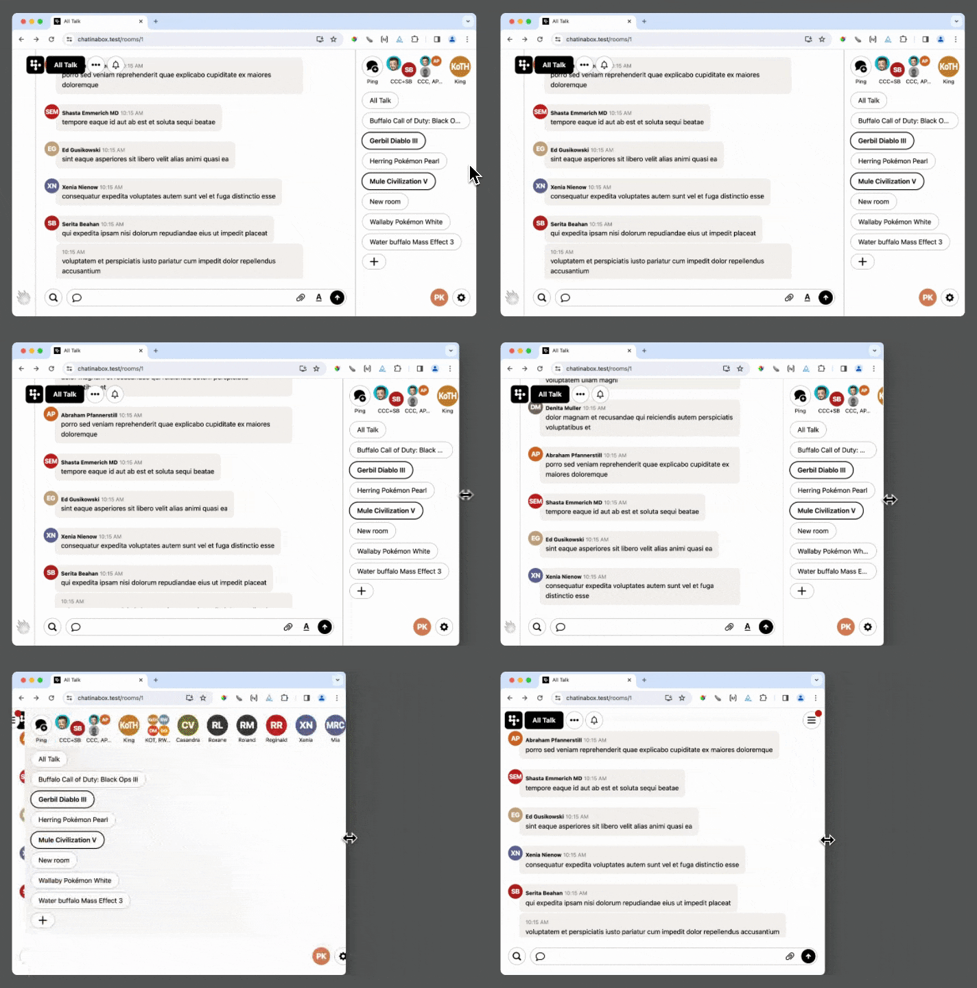
In this last section, we’ll take a look at Campfire’s approach to responsive design. The first thing to know is that Campfire has zero/none/nada viewport based @media queries. There are no attempts to assert that viewports narrower than x are mobile devices. Campfire’s layout fully adapts to whichever device you’re using in whichever configuration or orientation, without attempting to declare any state as “mobile”. Here’s how.
Layout
Campfire has a single @media breakpoint—one value, used in a number of places.
@media (max-width: 100ch) {
  ...
}
This breakpoint largely determines how the CSS grid layout must adjust when the viewport is too narrow to display the sidebar alongside the chat transcript. When the document is narrower than 100 characters, it’s not practical to render them side-by-side, so instead Campfire hides the sidebar and reveals a menu button to toggle it.

Using characters as the unit of measure ensures that we get the right behavior no matter which device you’re using and in a number of other scenarios such as multitasking on iPad or even if you simply enlarge the font size past a certain point. Type is the heart of web pages so it makes sense for the layout to respond to it.
Feature enhancements
The other place we use media queries is to respond to the kind of input device the user has. It’s never been fair to assume a device with a narrow viewport has a touch screen, nor that a device with an enormous viewport does not. This blurry line is not getting clearer. But thanks to @media queries we can actually get useful information about a device’s capabilities. First up, any-hover.
@media (any-hover: hover) {
  &:where(:not(:active):hover) {
    /* hover effect */
  }
}
This queries the user’s device to see if it has any input mechanism that is capable of hovering (probably a mouse). It won’t match on touch screen devices and will opt out of Mobile Safari’s annoying behavior that makes you double-tap things that have a hover effect. Not bad.
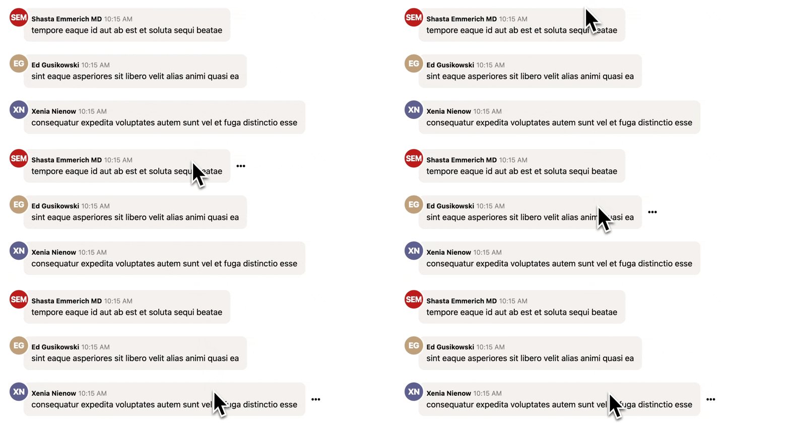
But let’s look at something a little more impressive. Every message line in a Campfire chat has a ••• button that reveals a menu of extra actions (edit, Boost, copy, share) that you can do.

On devices with a mouse or trackpad the ideal is to only reveal the menu when you hover over the message but that would make it inaccessible on touch devices. No problem. We can use any-hover along with the pointer query to get the behavior we want on each kind of device.
@media (any-hover: hover) and (pointer: fine) {
  /* Reveal the button only on hover */
}

@media (any-hover: none) and (pointer: coarse) {
  /* Show the button all the time */
}
This is especially magical with a device like the iPad Pro. Which can match both queries under certain conditions, and change on-the-fly. When it’s docked on the Magic Keyboard with built-in trackpad, it matches the first query and the ••• buttons are hidden until you hover. Lift it off the Magic Keyboard and it becomes a purely touch device—the ••• buttons magically appear. It’s very cool.
What’s next?
Campfire 1.0 shipped in January 2024 and by March we had already started to work on the next ONCE product. While Campfire supported bleeding edge features when was released the web platform is rapidly changing and we’re already exploring new features that have gained browser support since then. It’s a fantastic time to be working on the web.
If you haven’t tried Campfire yet, it’s available now at once.com, the first of a family of products that you buy once, own forever (including source code), and can do what you want with.
Questions?
Have a question, comment or idea? Want to see more posts like this? Get in touch at jz@37signals.com or x.com/jasonzimdars
Sign up to get posts via email,
or grab the RSS feed.
