
HEY’s built-in navigation can be challenging for customers. They reach out about this all the time:
Things can often times be confusing and complicated when wanting to quickly navigate throughout HEY. Going through sub menus like Contacts, I want to edit and go back. This however becomes complicated as I end up being thrown all the way back to the Imbox. So every time I want to edit multiple contacts, or join them together, I have to make giant loops around navigation.
and…
If I’m in the “Everything” view, and open an email, is there a keystroke or command that will send me back to the “Everything” view or is my only option to return to the inbox?
and one more…
I have an important feature request. Whenever I view a specific label (let’s say My Label), click into a specific email, and then hit the back button, I always end up in Paper Trail instead of My Label, and I find this behavior inexplicable. I’d love to see this quirk addressed in one of the next updates.
Core to the issue is the prominent Imbox button at the top left of HEY’s navigation bar. It looks like a back button but acts like a home button. The Imbox is the root of the app and it’s often convenient to be able to easily jump back to it, but not always.
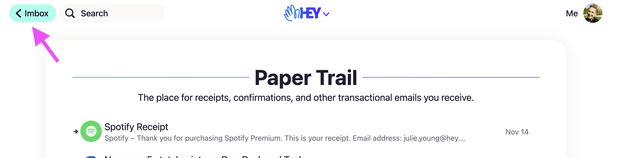
Awhile back we attempted to improve this situation by adding a back button in a handful of places. For example, if you open an email in the Paper Trail, instead of Imbox at the top, you’ll see Back, which takes you back to the Paper Trail. Great, right? Well, not always. Because if you open that same email via Search or Everything, or from a Contact you still get that same Back button and, unfortunately, it still takes you back to the Paper Trail.
Turns out it’s not a back button at all—it’s an up button that ascends the navigation hierarchy to the section that email is located. It’s great when it seems to take you back but confounding when it doesn’t.
Here, Ifify
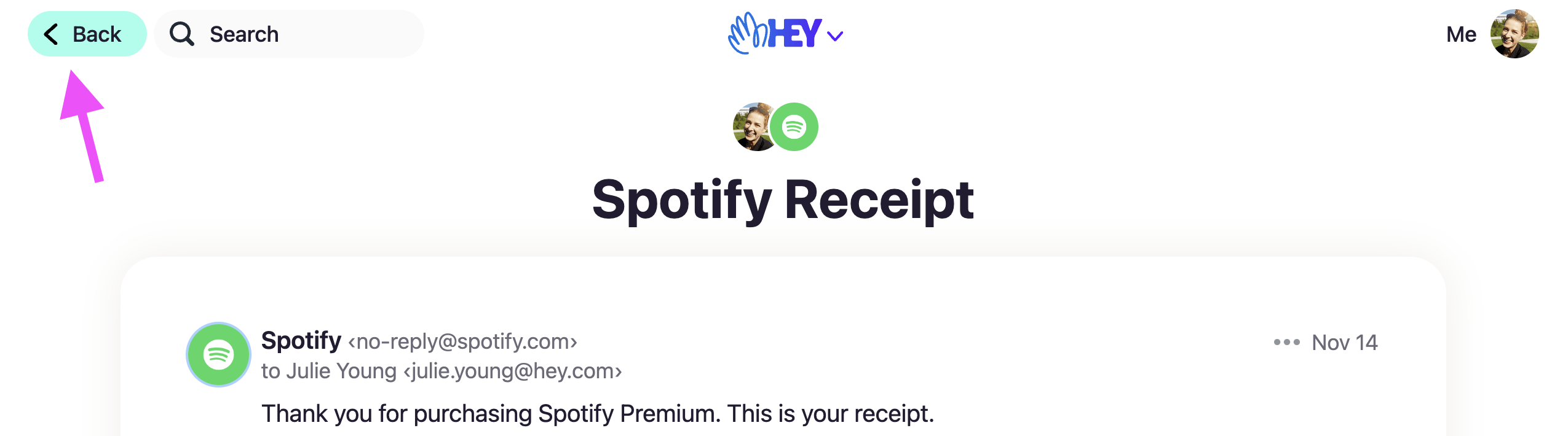
So Matt Hutchinson and I set out to make a back button that actually does what it promises. Developers might be thinking, “Oh so you added history.back() to the button and called it a day, what’s so hard about that?” It turns out it isn’t quite that simple. Plus, we had a hunch we could do better than simply replicating the behavior you already get with the browser’s back button. Instead, we found a way to give you a back button when you need it, but provide just enough hierarchical navigation to keep you from getting lost. And it all works in concert with the browser’s back button.
Most of the time HEY will work just as it does today with the Imbox button as a reliable way to get back to the root of the app. When you do see a back button, it’ll now actually take you back to where you came from. Here’s how it looks:
The details
To do pull this off, we did a few things. First, HEY checks to make sure that Back is taking you to a trusted referrer—it should never back you out of the app to another website. This could happen if you shared a link or used a bookmark to something in HEY. If HEY detects that’s happening, it’ll render an Imbox button instead.
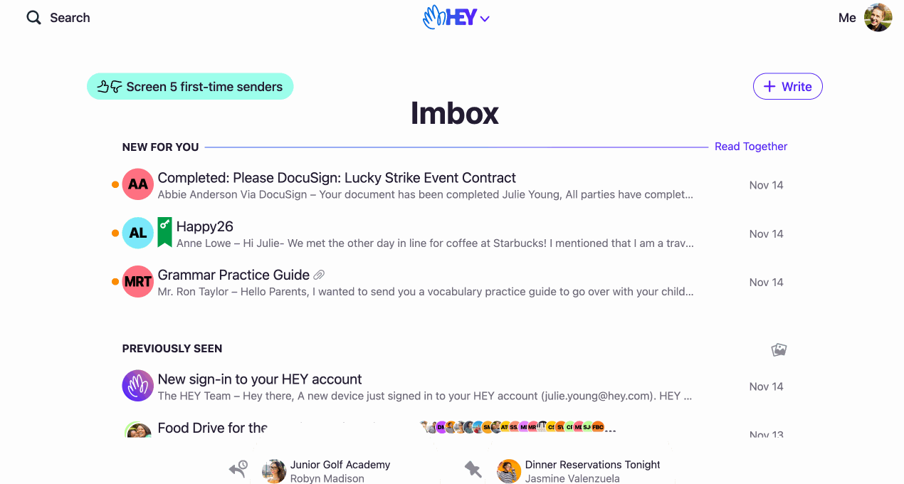
Next, HEY maintains its hierarchical order. For example, if you navigate from Imbox → Paper Trail, there isn’t a back button, you always return to the Imbox. That’s a subtle difference but we want to guide people to the right place rather than robotically taking them through their entire browsing session. To put it another way, no matter how deep you navigate in HEY, all roads lead back to the Imbox. If you hit Back enough times you’ll eventually see an Imbox button. In practice this is usually only 2-3 times. It’s hard to explain but feels natural. Keeping the original hierarchical navigation intact is an important way to keep existing customers from having a Who Moved My Cheese moment.
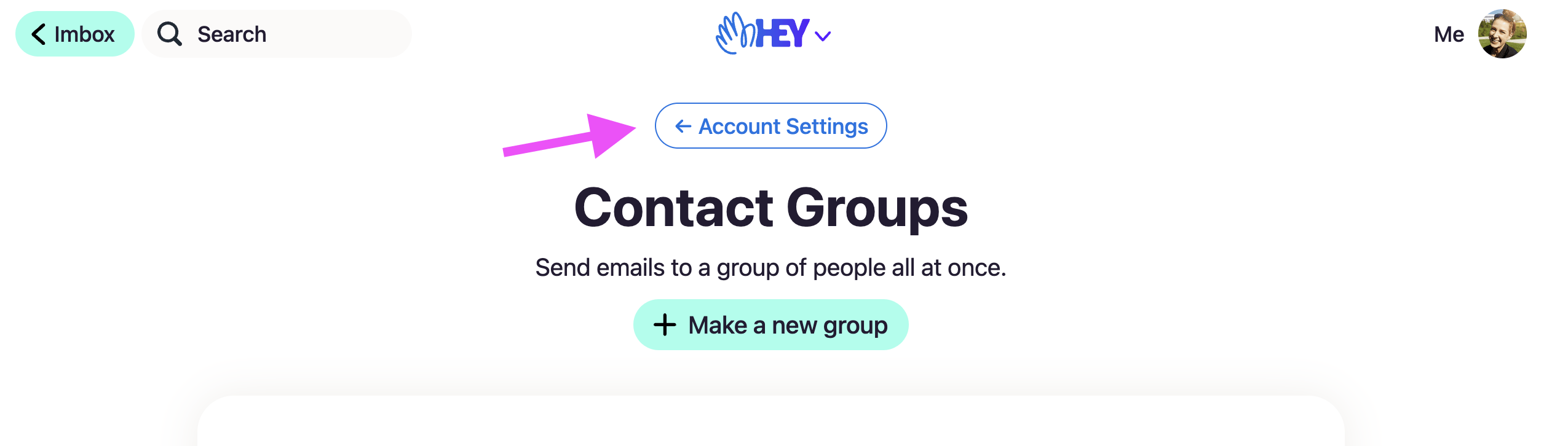
Finally, in certain sections HEY has a subnavigation that identifies the section and helps you get back to the index so you can see the entire plate of options. Account Settings and Login & Security are two such sections. You might land on a screen deep in those sections from an onboarding email, for example, and it’s helpful to be able to see where you are and navigate up to the top-level screen so you can discover other settings options. The problem was, we didn’t offer that subnavigation on every screen in the section. Now we do.
What we didn’t do
When a team (like Matt and I) starts a new cycle project it comes with an appetite, in this case 2 weeks. We spent roughly one week exploring and discussing various approaches, a few days implementing the chosen direction, and a few more on testing, code review and QA. The constraints on team size (1 designer and 1 programmer) and time (2 weeks) has a huge influence on the kind of feature that can we ship to customers. It’s almost always a benefit.
We tried a literal back button that simply replicated the behavior of the brower’s back button but there were complications like what to do on a new visit or page refresh when the history is gone. And it felt bewildering and unhelpful to navigate backward essentially forever on a long browsing session. Not to the mention security limits on peeking into JS history.
So we looked into Turbo restorationData but only uncovered more edge cases and complexity. Same thing with adding native navigation to HEY for Desktop. Nothing we couldn’t solve, of course, with a larger appetite but we didn’t have that luxury. And in fact, the time constraint forced us to reach for a simpler solution. Less code, fewer changes for users, fewer edge cases, easier testing and a feature that shipped on-time. Instead of completely overhauling HEY’s navigation, we left a lot of it alone choosing to layer-in improvements rather than throwing it all away and shipping the first-class, ideal solution a month later (maybe).
It just works
This isn’t the kind of release that arrives with a lot of fanfare. In fact, if we nailed it, customers won’t notice it at all! HEY’s navigation will simply work they way it’s always promised to based on the visual UI cues. It should feel natural, intuitive and helpful. Take it for a spin and tell us what you think!
Sign up to get posts via email,
or grab the RSS feed.